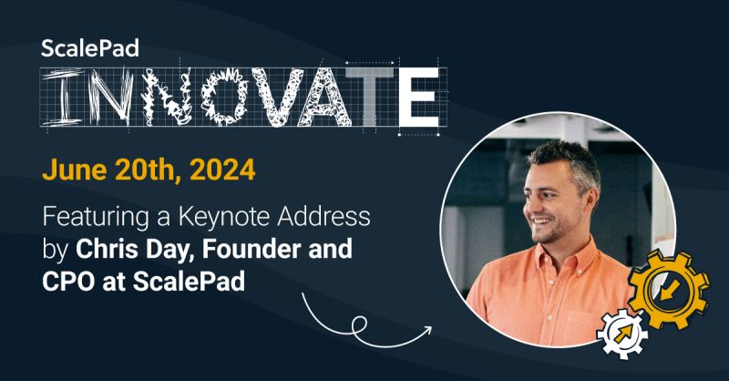
Register for ScalePad Innovate, June 20th 2024
This live event covers ScalePad’s product vision and market strategy directly from our leadership team.
Quoter news, product updates and B2B sales strategy.
Register for ScalePad Innovate, June 20th 2024
This live event covers ScalePad’s product vision and market strategy directly from our leadership team.

Quoter Product Update: April 2024
Big updates to the Quoter platform for April 2024! These include Amazon product lookup, HaloPSA integration enhancements, and a new in-app editor.
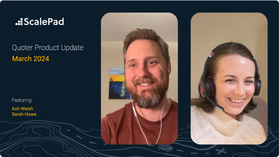
Quoter Product Update: March 2024
Quoter product updates for March 2024 include improvements to ConnectWise and Syncro integrations and contract management workflow.
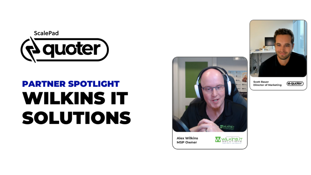
Wilkins IT Solutions consolidated its sales process into one step with Quoter.
By harnessing Quoter’s integrations for PSA, distributors, e-signature, and online payments, even junior staff at Wilkins IT Solutions can prepare quotes in minutes.
What you lose when your sales quotes are inaccurate (and how to fix it)
Let's look at the impact of inaccurate quotes on your business and how to improve accuracy for quotes moving forward.
Quoter Product Update: February 2024
Quoter product updates for February 2024 include enhancements to its HaloPSA integration, and ConnectWise, HubSpot, and Pipedrive integration updates.
Referrals vs. marketing: what's better for attracting more MSP clients?
This article looks at the pros and cons of referrals and marketing as strategies for attracting more MSP clients.
For MSPs: How to boost your company's image with 5 quick wins
Word-of-mouth referrals might get you the first meeting with a new prospect, but what about all the steps in the sales journey after that?
Sneaky ways task duplication in the quoting process slows you down
Those duplicate tasks, they're sneaky! Here's how to identify and eliminate duplicate tasks in your quoting process.

Looks matter: how professional sales proposals get you ahead of the competition
Professional quotes (standardized, branded, concise, beautiful) can be a game-changer to get ahead of the competition.
3 New Year's Resolutions For Getting The Most Power Out of Quoter
Make 2024 the year you optimize your workflow, adopt a proactive revenue mindset, and boost your bottom line.
How to use Quoter to build better relationships in B2B sales
What if you could proactively build relationships without adding more tasks to your list? With Quoter, you can. Let's look at 5 Quoter features to save time.
How to introduce your customers to automated payment for recurring services
Want to reduce admin tasks and give clients an effortless experience? It's time to consider automating payments for recurring services.
MSPs: The trick to building customers relationships (when you’d rather focus on tech)
Introverts, fear not: Building customer relationships doesn't have to revolve around traditional networking events or constant face-to-face interactions.
Getting started with Quoter: Professional Service Implementation
Integrating a new quoting software into your business is not as easy as creating an account. It's the change of a business process that can be unfamiliar or habit-breaking that's the most difficult. We recognize this and have designed a...
MSPs: How (and why) to nurture better relationships with your existing clients
This article explores the benefits of nurturing better client relationships, including boosting referrals and recurring revenue, and how to take action ASAP.
5 ways Quoter helps MSPs retain clients while revising their service agreements
This article deep-dives into five ways Quoter can assist MSPs in retaining clients while revising their service agreements.
Unlocking your organization's growth: how recurring revenue could be the key for MSPs
Let's examine the importance of recurring revenue for MSPs and explore the various strategies that can be employed to unlock its potential.
MSPs: 9 clues it’s time to update your recurring service contracts
This article will explore ten clues that indicate it may be time to review and update your recurring service contracts.
How to train remote staff into your new quote-to-cash process
This article will explore how to train your remote staff into a new or updated quote-to-cash process to ensure a seamless transition.
3 automations to optimize quote-to-cash for industry event sales
This post explores how automation can enhance the efficiency of an industry event sales quote-to-cash workflow and reduce bottlenecks in sponsorship approvals.
MSPs: 10 Ways To Use Discount Codes To Grow Your Business
Discount codes are versatile tools that MSPs can utilize to grow their businesses. We've got 10 ways to use them for powerful impact.
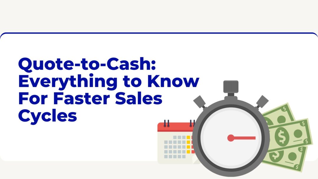
Quote-to-Cash: Everything to Know For Faster Sales Cycles
Quote-to-cash (QTC) refers to the revenue phase in a sales cycle. It begins with the quote and ends with receiving payment. Those steps, and others in between, make up the quote-to-cash process.
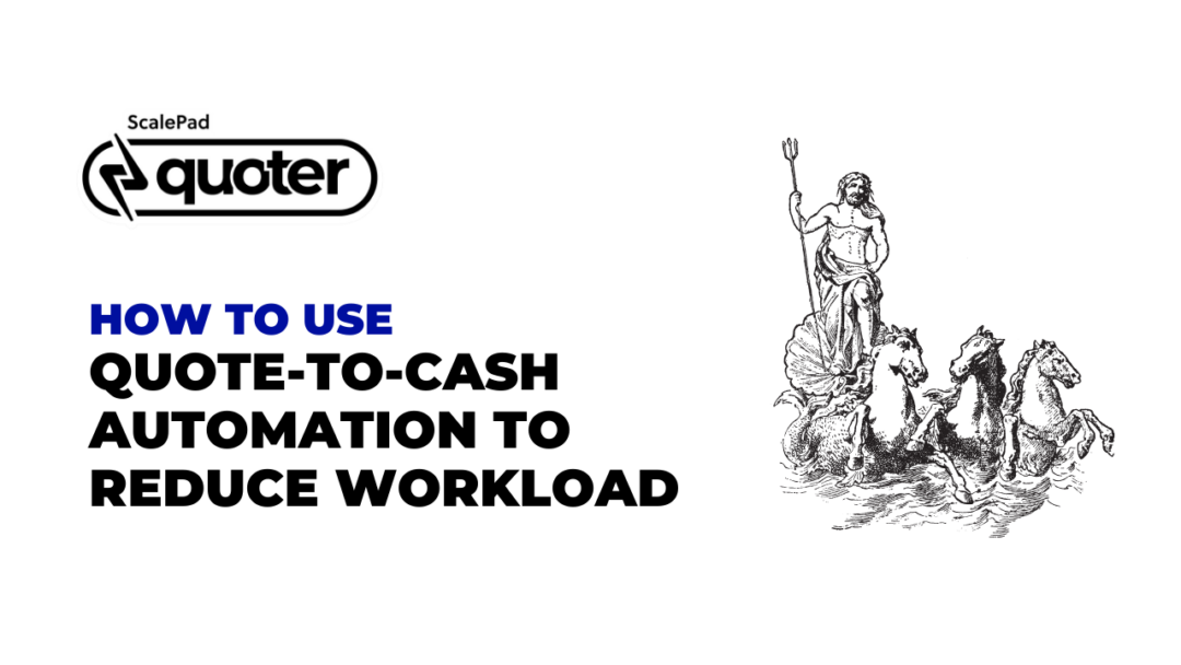
How to use quote-to-cash automation to reduce workload
This article will explore how quote-to-cash automation can revolutionize your organization's operations and help you achieve more with less effort.
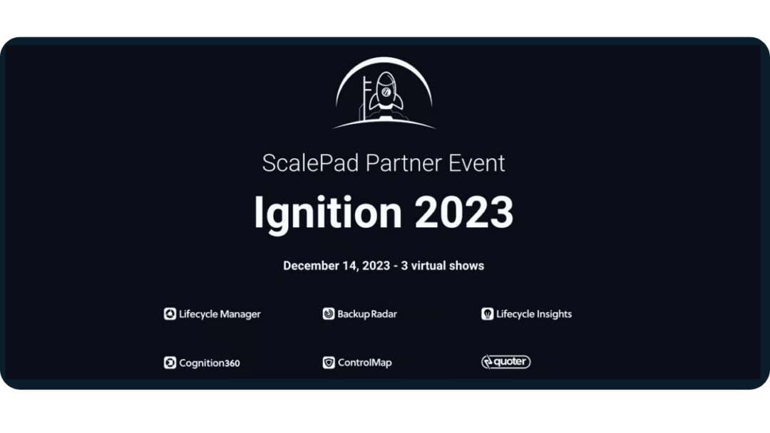
ScalePad Partner Event: Ignition 2023
Register today for our upcoming premier Partner event hosted by ScalePad on December 14th!
Showing 1 to 25 of 161 results
Don't miss our product updates, B2B growth tips and events.
We care about the protection of your data. Read our Privacy Policy.